


It comes up at every PowerBI conference I attend.

I was in a business luncheon at the Power BI World Tour Event in Seattle this week where THE Will Thompson said it was a ‘known issue’. But in playing around with it, I found a possible workaround that might save you from having to explain to your report consumers thinking ‘that should be fairly simple to do… right?’, that in fact, no.
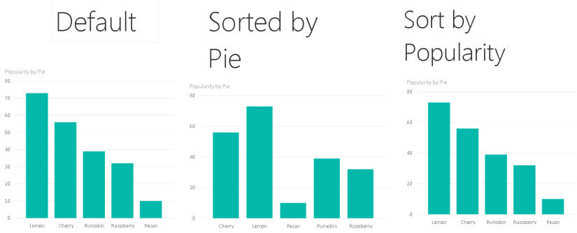
Let’s get to it. Here’s how to sort columns on a bar chart.
Say you start with some data. I made sure neither column was in any particular order.

Here’s what happens when I make a bar chart out of it:

I’m assuming PowerBI has some kind of default logic to sort these. From what it did here, it might be by amount.
SOLUTION: Sort the data in your table immediately before creating your visual. To do this, go to the data view on the left side of the application. Then click Modeling > Sort by Column > choose which column you’d like to have your bars sort on.

RESULT:
I sorted by data by “Pie” (A-Z), then made a visual and I got:

Boom!
The takeaway here is that you have to get your data sorted BEFORE you create the visual. If you change the sorting on your data later, it doesn’t affect the ordering of your bars.
And just because we can, let’s do all the possible combinations. Such Zen.
What else are you stuck on? Let me know and I might use it as an idea for a future post!
Con Mucho Am(ad)or,
Liz
